There are three most popular Forex chart types:
- Line Chart
- Bar Chart
- Candlestick chart
Line Charts
Line chart is a simple chart which is illustrates a line from one closing price to the next closing price. When line was formed, we can see the price movement of a currency pair in general at any given time.
Example for line chart in Daily GBP/USD:

Bar Charts
The bar chart shows the closing price, also simultaneously show opening price, high and low price. The bottom of the vertical bar indicates the lowest traded price for a certain time, while the top bar indicates the highest price. So the vertical bars indicate the range of currency pairs being traded. The horizontal line on the left bar is the opening price, and on the right bar shows the closing price.
Examples for Daily GBP/USD bar chart :
 Bar charts are also called "OHLC" charts, because it indicates Open, High, Low, and Close price for a currency. Here is an example of the price bar:


Open: small horizontal line on the left is the opening price
High: The top of the vertical line is the highest price at a certain time.
Low: The bottom of the vertical line is the lowest price at certain time.
Close: small horizontal line on the right is the closing price.
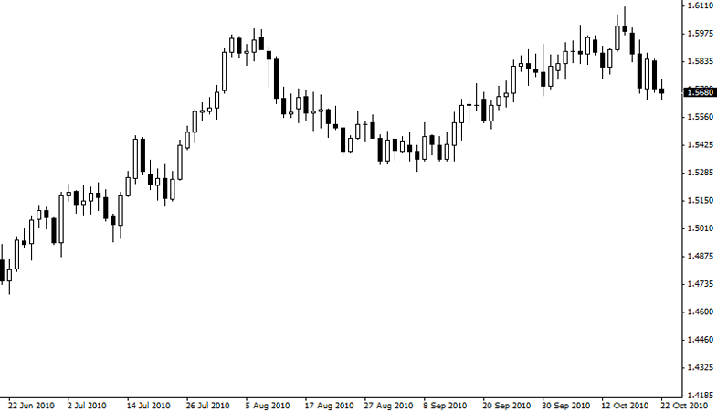
Candlestick Charts
Candlestick charts show the same information with a bar chart, but more nice views.
Candlestick bars still indicate the range from high-to-low with a vertical line. In candlestick charts, the largest body in the middle indicates range between opening and closing price. Generally, if body have a color, its indicate that the currency closed price lower than open price.
In the following example, the body is filled with black. Body is filled, the top is the opening price, and the lower part of the body is the closing price. If the closing price is higher than the opening price, the body will be white or blank, or colorless. Its mean the price being strength.

The picture below is example for candlestick in daily GBP/USD, its nice to view

The purpose of the candlestick chart is to provide nice views. The advantage of a candlestick chart is:
- Candlestick is very easy to interpret, and is an excellent media for beginners to learn analyze the chart.
- Candlestick is very easy to use. Your eyes will quickly adapt to the information on the bar notation.
- Candlestick and candlestick pattern has a cool name like shooting star, doji, hammer, which helps you to remember what is the meaning of a pattern that occurs.
- Candlestick is very useful to identify Market turning points - a reversal from an uptrend to downtrend or into an uptrend or a downtrend.
No comments:
Post a Comment